Choosing our Bath Tile
We were really in love with the size and shape of the tile we used in the guest bathroom (2×6 Heath Modern Basics in River Bed) that we decided to stick with Heath Ceramics for the Master Bath. We chose the following:
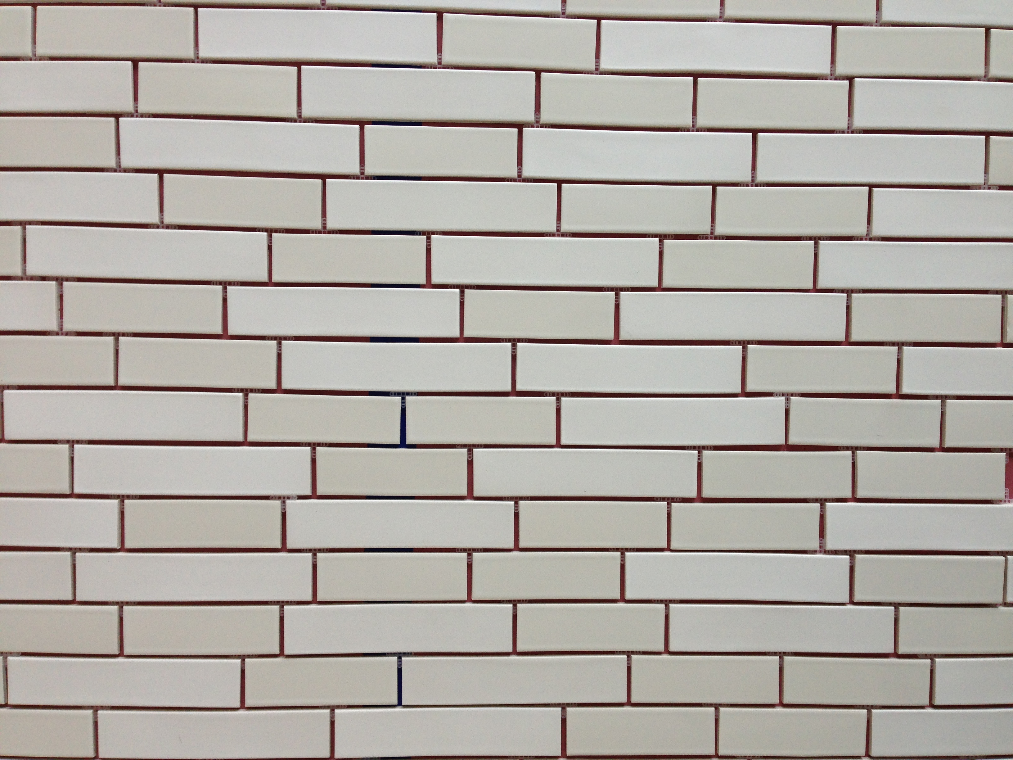
Modern Basics glossy white 2×6 mixed with Classic Field tile in Parchment 2×9, in a random pattern
Take a look at some photos and comments below:
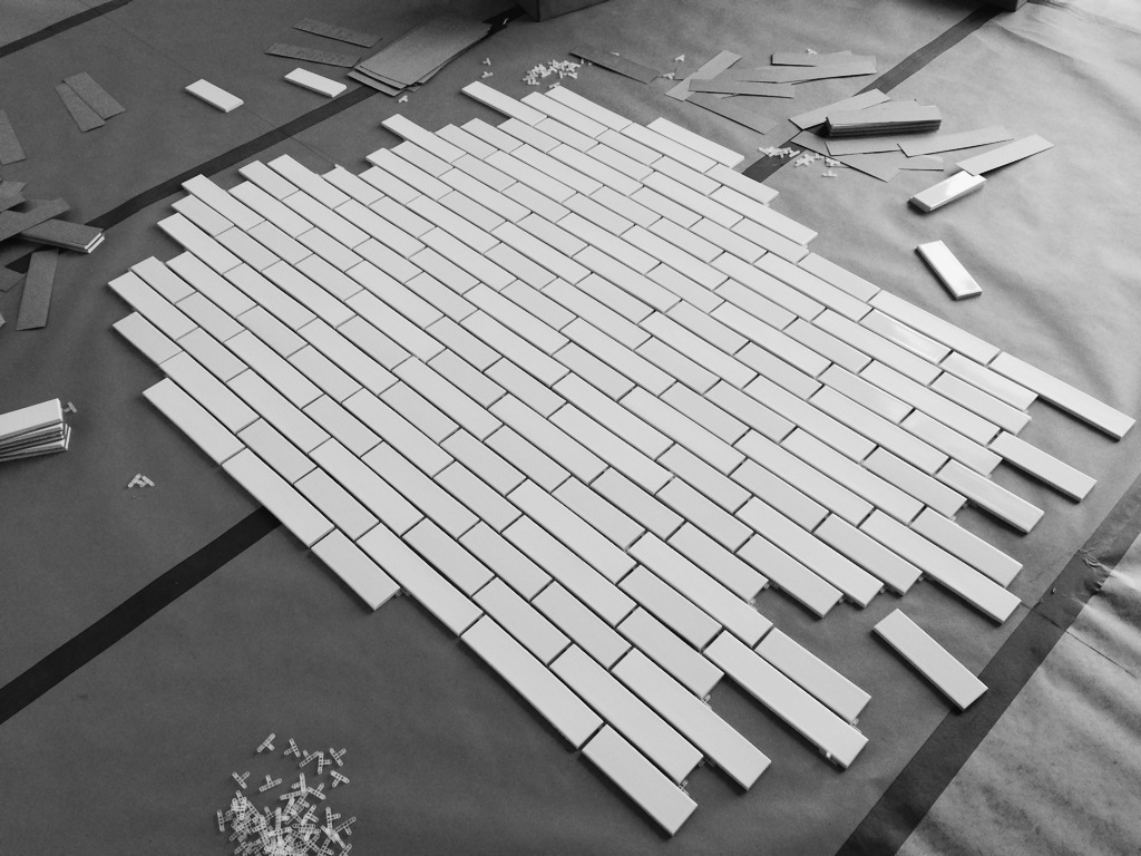
I asked for a random pattern because I knew that if the installer chose a pattern and made one tiny mistake that I’d notice it every time I took a shower. I’m really happy with the random pattern. The vertical placement is a theme throughout our house and facade and I like that your eye dances around a bit. Also, our installer first laid the tile on our floor (shown above) and after I approved it he started installation one row at a time.
TIP: When looking at tile patterns take a photo and then look at it as a black and white image. Your eye will more easily focus on the pattern and won’t get distracted by the color. If using a random pattern make sure your installer lays out the pattern on the floor instead of applying as he goes along.
To save money we decided to choose some in-stock tile mixed with some made-to-order tile. Plus I bought the in-stock tile during Heath’s annual sale which gave me 20% off the order. The made-to-order was also discounted because we are locals (yippe!).
We did about a 60/40 (in stock v. made-to-order) split on the tile again to save cost. I was a little disappointed that the in-stock tile sold at Heath is pretty creamy in color. I was hoping for a brighter white but I decided I liked the contrast. The tile manager helped me choose Parchment which is a brighter white but still one that looked good with the in-stock white. I also love the contrast between the matte and gloss.
TIP: Decide if you can live with an in-stock tile versus custom-made. You will realize a significant cost difference and it might only be a small compromise. Also, if you have time wait for Heath’s annual sale to make your purchase or collect Heath Overstock tiles (more on that below) throughout the year to build enough for you project.
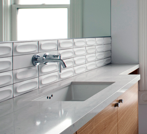
This image is not my bathroom but I am obsessed with Heath’s dimensional tile. I’m determined to find enough Heath Overstock over the next few months to finish a back-splash in the kitchen. The Heath Overstock room is a special little part of the factory in Sausalito where all of the extra or slightly abnormal tiles live. This is a great place to get Heath tile on a budget BUT make sure to:
- Buy something like 20-30% more tile than you need for your project. Heath tile is beautiful but it’s in the Overstock room for a reason. This is especially important if you are buying 2nd quality versus 1st quality.
- Use Heath’s tile specialists! They will be a big help and open your eyes to some options you might not have thought about.
- Check their Overstock selection weekly. No need to run to the factory, you can check the list online, right here.
- When you or your installer are ready to install the tile MAKE SURE YOU GO THROUGH THE BOX AND PULL OUT UNACCEPTABLE TILE. This point is painful for me to admit because I trusted my installer and not only told him to pull out bad tiles before he started but I also marked tile that I thought was unacceptable once installed. He pulled down a few tiles that I was unhappy with but not all of them. Before I knew it he had grouted the tile (darn!). Then I found a totally unopened box of tile that they had never sorted through. Now every time I take a shower I look immediately at the small flaws. It drives me a little crazy so do your best to avoid my mistake.
- Use 3/8″ grout. The larger grout will make your Heath tile, especially 2nds look more straight; anything smaller and flaws will be easier to spot.
Now on to the floor tile. I really wanted large-scale tile for the bathrooms and I wanted a neutral palette that felt like a raw material. It was a little too expensive to pour a concrete floor so we went with something relatively similar to that idea.
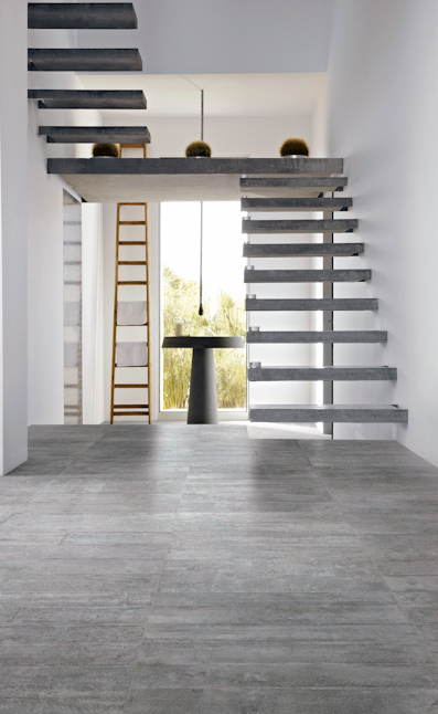
We choose a durable porcelain tile called Utah Sand from Artistic Tile. It’s sold in 24″x24″ pieces. We had those pieces cut into 6×24 pieces. I’m really happy with the results. It looks very neutral a sort of warm-grey. The floor is kind of matte and it always looks clean. We choose a black grout which sounds bad but works really well. I like that the floor ties in to the use of concrete downstairs and it looks really nice with the other tile we chose.
Above is a photo from Artistic Tile’s website. I’ll share a shot of our floor soon.
TIP: If you’re using this specific tile the sample we saw at the showroom was different than what showed up at our house. The tile that showed up, while it was the same color and more or less the same it had some areas that looked like faux wood. That was not something we liked. We had our installer cut out those bits and we ended up having to order more tile to finish the bathroom.
Good luck with your tile project! What do you think of our tile choices? Do you have any other tips to add?
Reference: Houseandfig.com